Pedro Pinto Automobiles
Brand Identity
The Pedro Pinto dealership is an automotive company that has been on the market for 10 years.
After 16 years' experience working for large car groups, manager Pedro Pinto decided to take a chance and set up his own business. With a great ability to communicate and an intrinsic facility for establishing interpersonal relationships, launching out into the market on his own was the step that has now earned him the trust and loyalty of his customers.
About the project
As it was a redesign project, it was imperative to understand precisely what, at the moment, made sense for the manager and his brand. To understand the stage the company was at, why it had decided to invest in a visual identity project, the future goals it was trying to achieve and the competition. It should be noted that, as it is a personal brand and its name is the manager's first name, the visual identity was developed taking into account the company's message and purpose and, ultimately, the reference the name has in the market.
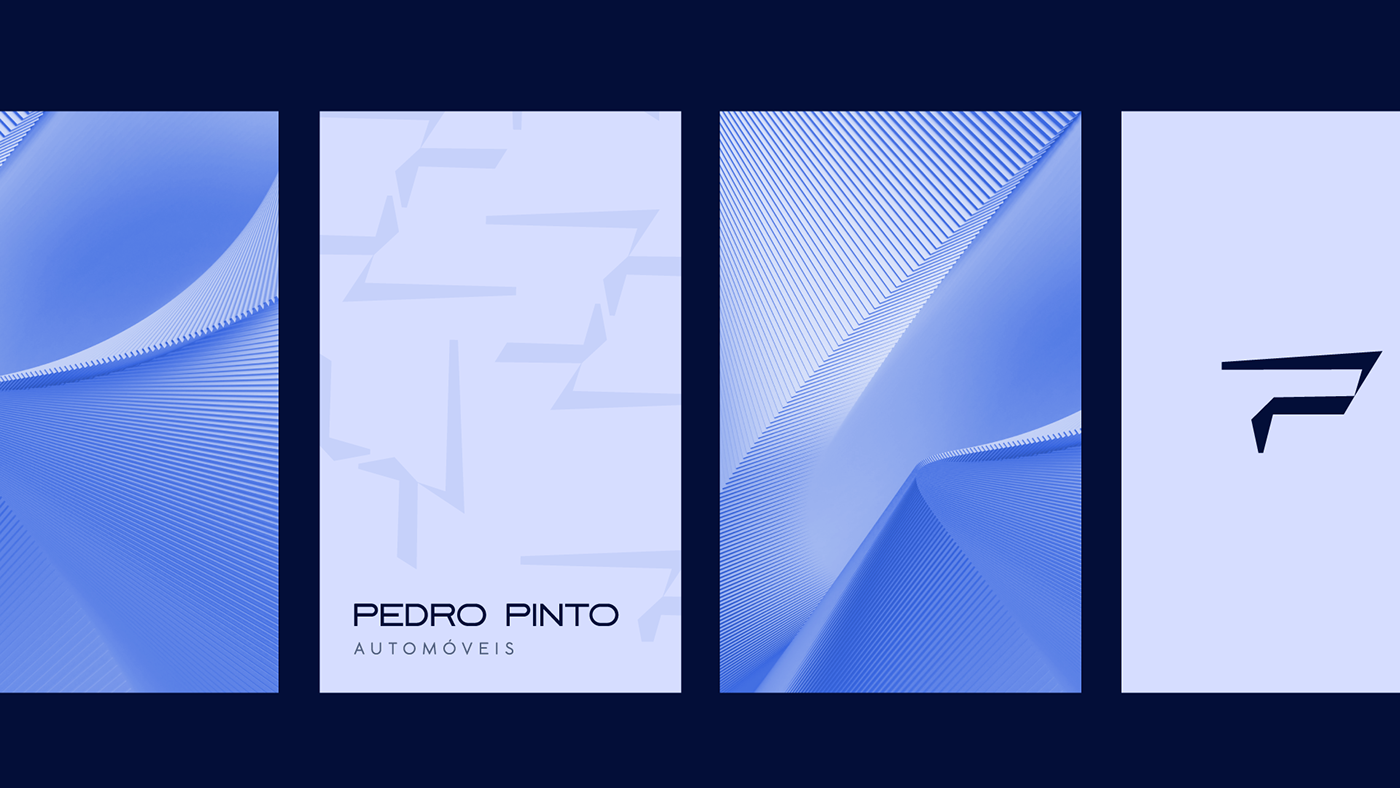
The visual identity of the Pedro Pinto stand was based on three fundamental concepts: modernity, professionalism and trust. The visual signature symbol is the element created that makes the brand so visually impactful, and which makes it stand out unequivocally from its competitors.

The symbol emerges from an arrow, which symbolizes change, ascension and the company's future innovation; from the junction of two geometric shapes that come together at just one point - conveying the message that reflects the core of the brand: individually they are just two shapes, but when they fit together and interconnect they become a concept, and this is what the Pedro Pinto brand seeks to convey through its sales and after-sales services; and from the letter "P", the initial letter of the two names of the manager and consequently of the company; and the letter "P", the initial letter of the two names of the manager and consequently of the company, and which therefore carries great significance for it.
The palette leans towards shades of blue and has 3 main and 2 secondary colors. One of the brand's objectives is to convey professionalism, trust and stability. Blue is the color that plays this role best in the right shades. In addition, at a strategic level, it places the Pedro Pinto brand in a prominent position in relation to its competitors.
The logo's typography has a strong character and an attractive personality, bringing the sense of speed but without losing the more professional "stance". It is in capital letters in order to bring a sense of elegance, authority and maturity.